Action forms let you collect user input before executing an action. Forms can be static with fixed fields, or dynamic with fields that adapt based on context or user input.
Action form displayed in Forest

Field properties

Fields are configurable using the following properties:
PropertyRequiredTypeDescription
typeYesstringField type: Boolean, Date, Dateonly, Enum, Json, Number, NumberList, EnumList, String, StringList, File, FileList, Collection
labelYesstringLabel displayed to the user
idNostringInternal identifier. If not set, the label is used. Use this to access values in context.formValues
descriptionNostringHelp text displayed below the field
isRequiredNobooleanMake the field required (default: false)
defaultValueNoanyDefault value pre-filled in the form
isReadOnlyNobooleanMake the field read-only (default: false)
enumValuesRequired for Enumstring[]List of possible values when type is Enum
widgetNostringUI widget to use (see widgets section below)
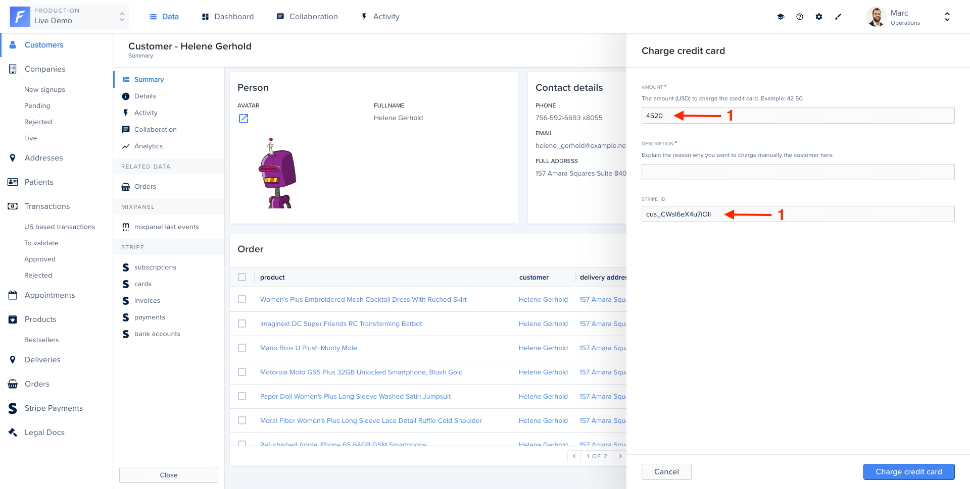
Basic form example

agent.customizeCollection('customers', collection => {
  collection.addAction('Charge credit card', {
    scope: 'Single',
    form: [
      {
        type: 'Number',
        label: 'Amount',
        description: 'Amount in USD (e.g., 42.50)',
        isRequired: true,
      },
      {
        type: 'String',
        label: 'Description',
        widget: 'TextArea',
      },
    ],
    execute: async (context, resultBuilder) => {
      const { Amount, Description } = context.formValues;
      const customer = await context.getRecord(['stripeId']);

      // Charge the credit card
      await stripe.charges.create({
        amount: Amount * 100,
        currency: 'usd',
        customer: customer.stripeId,
        description: Description,
      });

      return resultBuilder.success('Charged successfully!');
    },
  });
});

Field types

String

Text input for short strings.
{ type: 'String', label: 'Name' }
Use the TextArea widget for longer text:
{ type: 'String', label: 'Description', widget: 'TextArea' }

Number

Numeric input with optional constraints.
{ type: 'Number', label: 'Amount', defaultValue: 0 }

Boolean

Checkbox for true/false values.
{ type: 'Boolean', label: 'Send confirmation email' }

Date and Dateonly

Date picker for dates with or without time.
{ type: 'Date', label: 'Delivery date and time' }
{ type: 'Dateonly', label: 'Birth date' }

Enum

Dropdown with predefined options.
{
  type: 'Enum',
  label: 'Status',
  enumValues: ['pending', 'approved', 'rejected'],
  isRequired: true
}

Collection

Reference to a record from another collection.
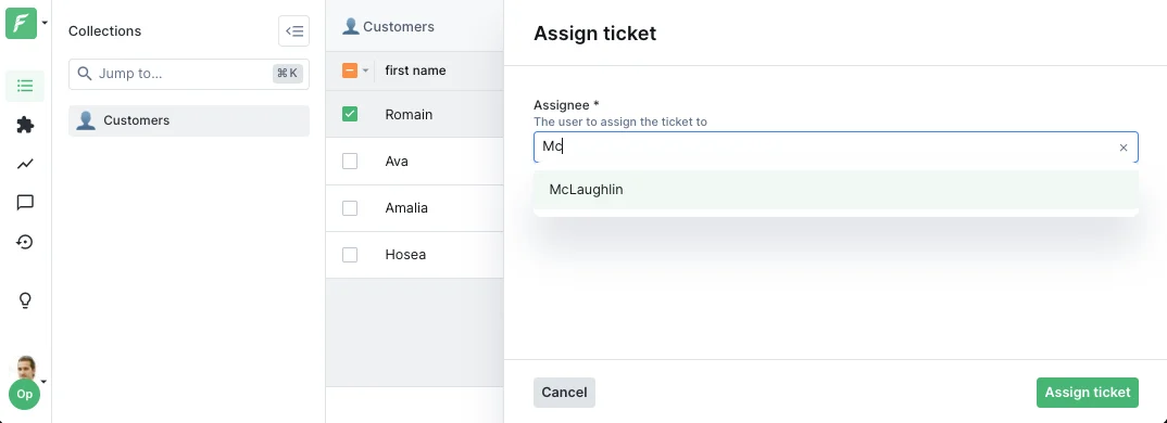
{
  type: 'Collection',
  label: 'Assignee',
  collectionName: 'users',
  description: 'Select the user to assign this ticket to'
}
Collection reference widget on an action form
The value will be the primary key of the selected record (as an array for composite keys).

File and FileList

File upload fields.
{ type: 'File', label: 'Upload document' }
{ type: 'FileList', label: 'Upload attachments' }

Lists

Arrays of values.
{ type: 'StringList', label: 'Tags' }
{ type: 'NumberList', label: 'Scores' }
{ type: 'EnumList', label: 'Categories', enumValues: ['A', 'B', 'C'] }

Dynamic forms

Make forms reactive by using functions instead of static values. Functions receive the action context and access form values and selected records.

Dynamic required fields

Make a field required based on another field’s value:
form: [
  {
    type: 'Number',
    label: 'Amount',
    isRequired: true,
  },
  {
    type: 'String',
    label: 'Justification',
    description: 'Required for amounts over $1000',
    // Only required if amount > 1000
    isRequired: context => context.formValues.Amount > 1000,
  },
]

Conditional visibility

Show or hide fields based on conditions:
form: [
  {
    type: 'Boolean',
    label: 'Send email notification',
    id: 'sendEmail',
  },
  {
    type: 'String',
    label: 'Email address',
    // Only show if sendEmail is checked
    if: context => context.formValues.sendEmail === true,
  },
]

Default values from record data

Pre-fill form with data from the selected record:
form: [
  {
    type: 'Number',
    label: 'Refund amount',
    // Default to the order total
    defaultValue: async context => {
      const order = await context.getRecord(['total']);
      return order.total;
    },
  },
]

Dynamic enum values

Change dropdown options based on context:
form: [
  {
    type: 'Enum',
    label: 'Department',
    id: 'department',
    enumValues: ['Engineering', 'Sales', 'Support'],
  },
  {
    type: 'Enum',
    label: 'Team',
    // Teams depend on selected department
    enumValues: context => {
      const dept = context.formValues.department;
      if (dept === 'Engineering') return ['Backend', 'Frontend', 'DevOps'];
      if (dept === 'Sales') return ['Inbound', 'Outbound'];
      if (dept === 'Support') return ['L1', 'L2', 'L3'];
      return [];
    },
  },
]

Dynamic collection references

Change the target collection dynamically:
form: [
  {
    type: 'Enum',
    label: 'Entity type',
    id: 'entityType',
    enumValues: ['user', 'company'],
  },
  {
    type: 'Collection',
    label: 'Entity',
    // Collection name depends on entity type
    collectionName: context => context.formValues.entityType,
  },
]

Widgets

Widgets customize the UI appearance of fields. Here are the most common ones:

TextArea

Multi-line text input.
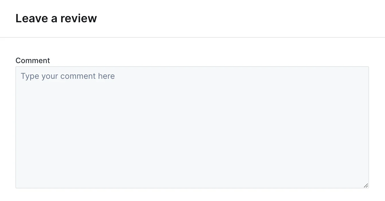
{ type: 'String', label: 'Notes', widget: 'TextArea' }
TextArea widget on an action form

TextInput

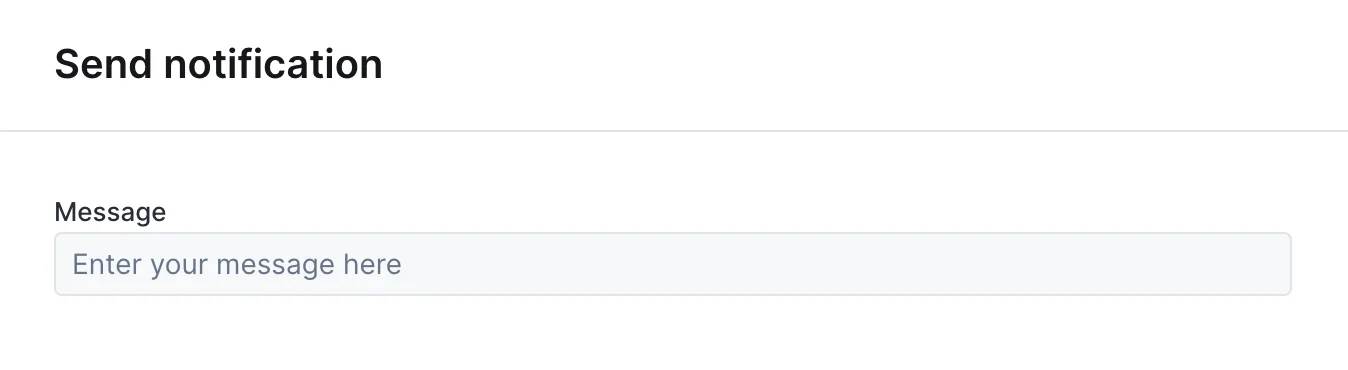
One-line text input, the default widget for String fields.
{ type: 'String', label: 'Name', widget: 'TextInput' }
TextInput widget on an action form

TextInputList

One-line text input to enter a list of string values.
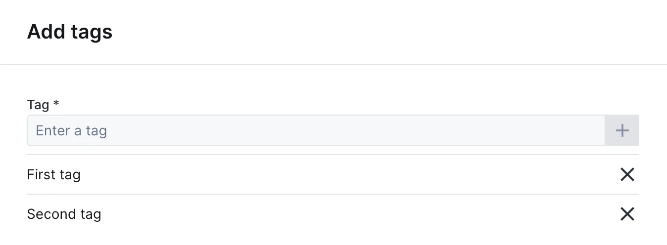
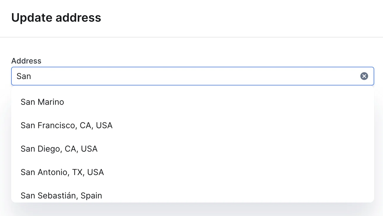
{ type: 'StringList', label: 'Tags', widget: 'TextInputList' }
TextInputList widget on an action form

AddressAutocomplete

Text input with address autocomplete powered by the Google Maps API.
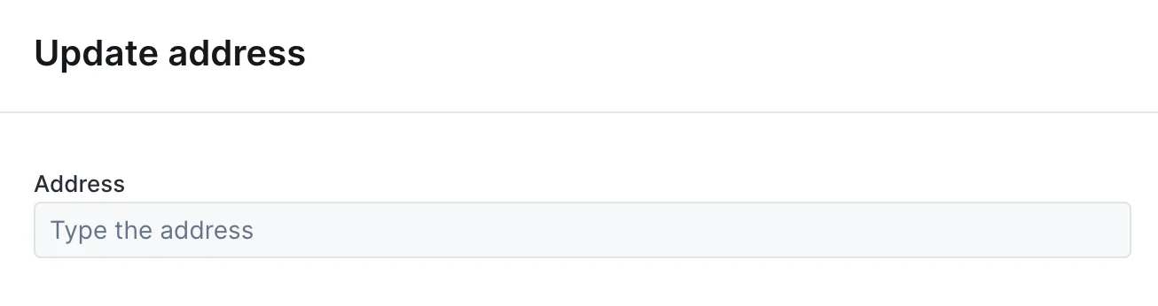
{
  type: 'String',
  label: 'Address',
  widget: 'AddressAutocomplete',
  placeholder: 'Type the address here'
}
AddressAutocomplete widget on an action form, empty state
AddressAutocomplete widget on an action form, with suggestions

Checkbox

Single checkbox for boolean values.
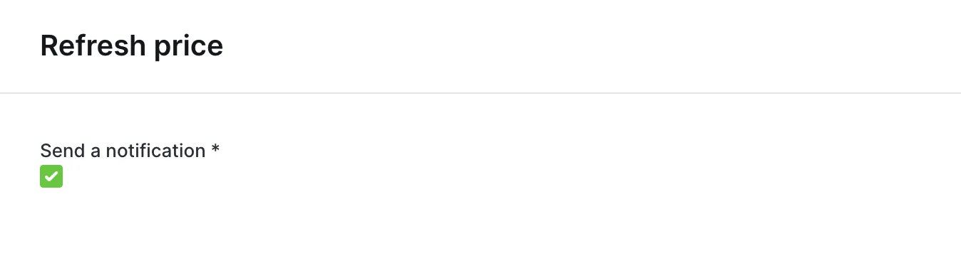
{ type: 'Boolean', label: 'Send a notification', widget: 'Checkbox' }
Checkbox widget on an action form
Alternative to Enum for dropdown selection.
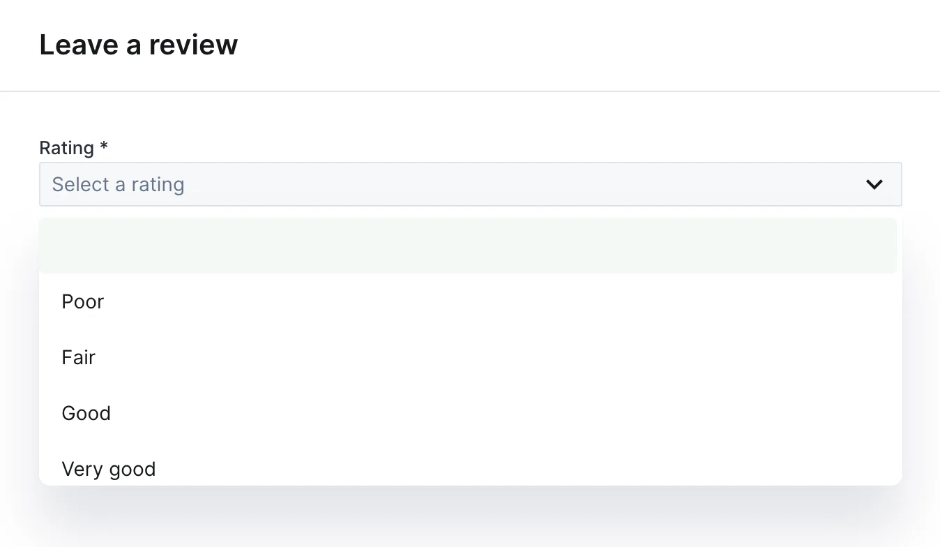
{
  type: 'String',
  label: 'Priority',
  widget: 'Dropdown',
  options: ['Low', 'Medium', 'High']
}
Dropdown widget on an action form

RadioGroup

Radio buttons for single selection.
{
  type: 'Enum',
  label: 'Plan',
  widget: 'RadioGroup',
  enumValues: ['Free', 'Pro', 'Enterprise']
}
RadioGroup widget on an action form

CheckboxGroup

Checkboxes for multiple selection.
{
  type: 'EnumList',
  label: 'Features',
  widget: 'CheckboxGroup',
  enumValues: ['API Access', 'Priority Support', 'Custom Domain']
}

DatePicker

Calendar widget for date selection.
{ type: 'Date', label: 'Appointment', widget: 'DatePicker' }

TimePicker

Input for entering a time value.
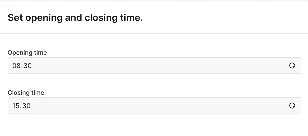
{ type: 'Time', label: 'Opening time', widget: 'TimePicker' }
TimePicker widget on an action form

ColorPicker

Color selection widget.
{ type: 'String', label: 'Brand color', widget: 'ColorPicker' }

FilePicker

File upload with preview.
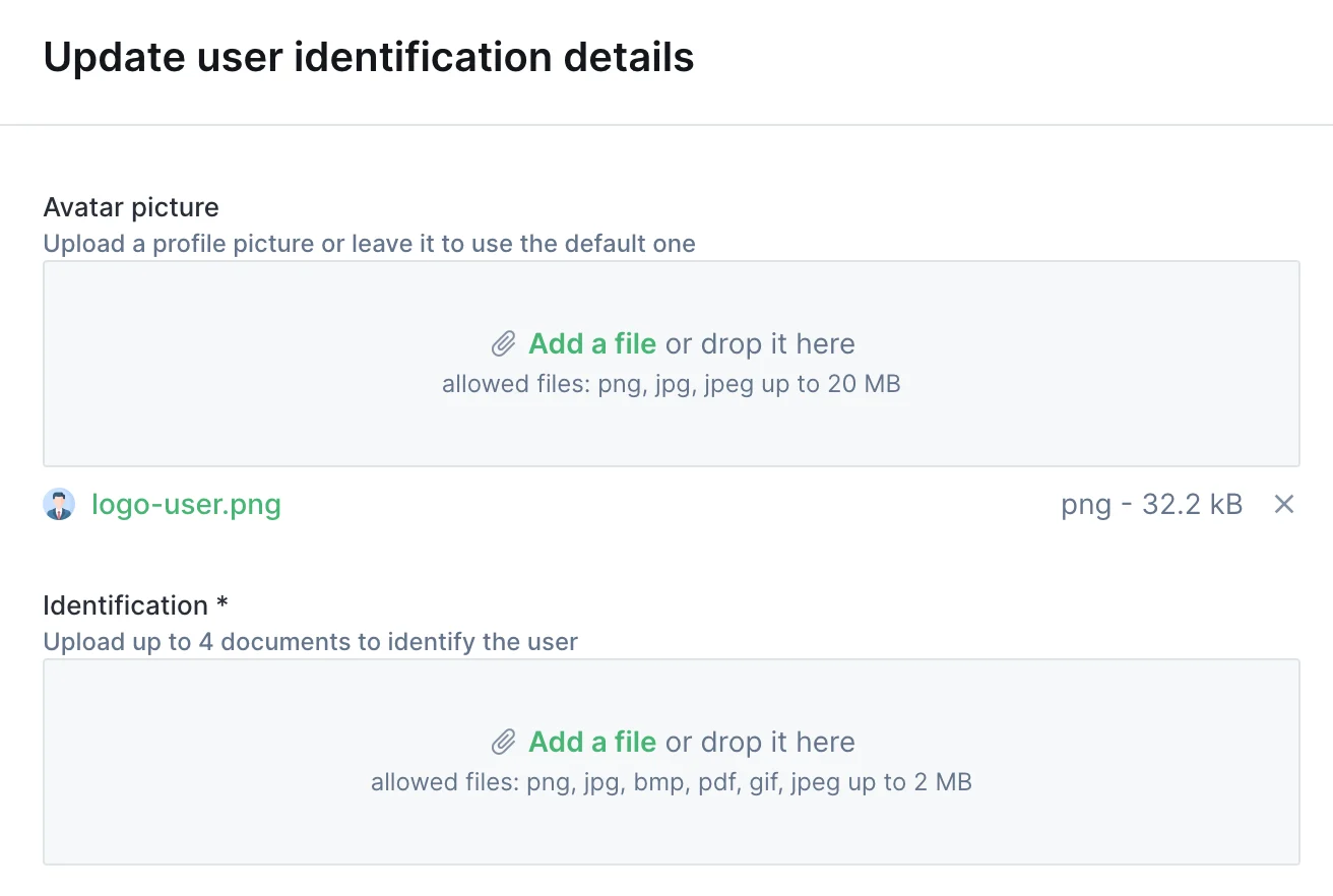
{ type: 'File', label: 'Profile picture', widget: 'FilePicker' }
FilePicker widget on an action form

JsonEditor

JSON editor with syntax highlighting.
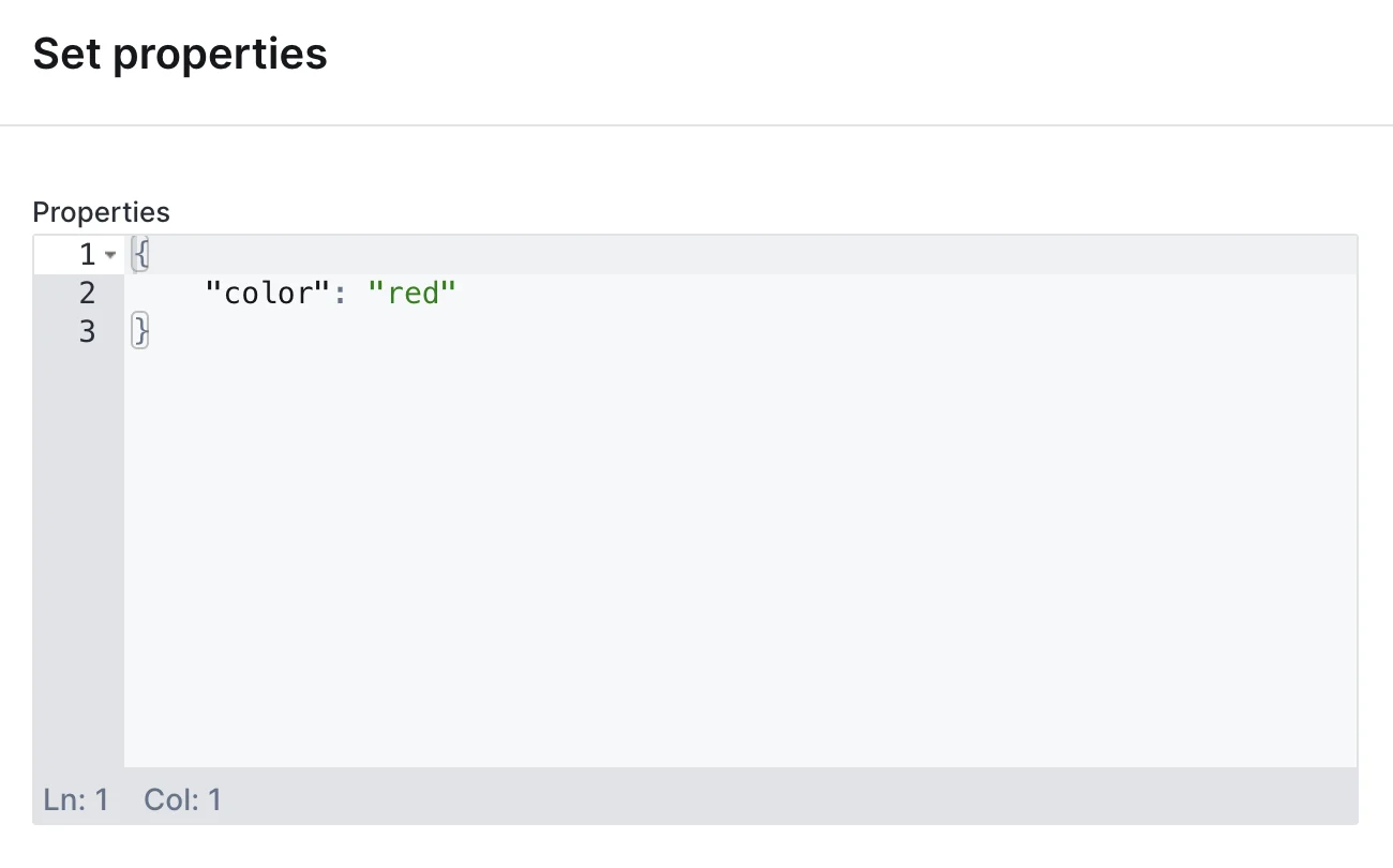
{ type: 'Json', label: 'Configuration', widget: 'JsonEditor' }
JsonEditor widget on an action form

UserDropdown

Dropdown pre-filled with Forest users.
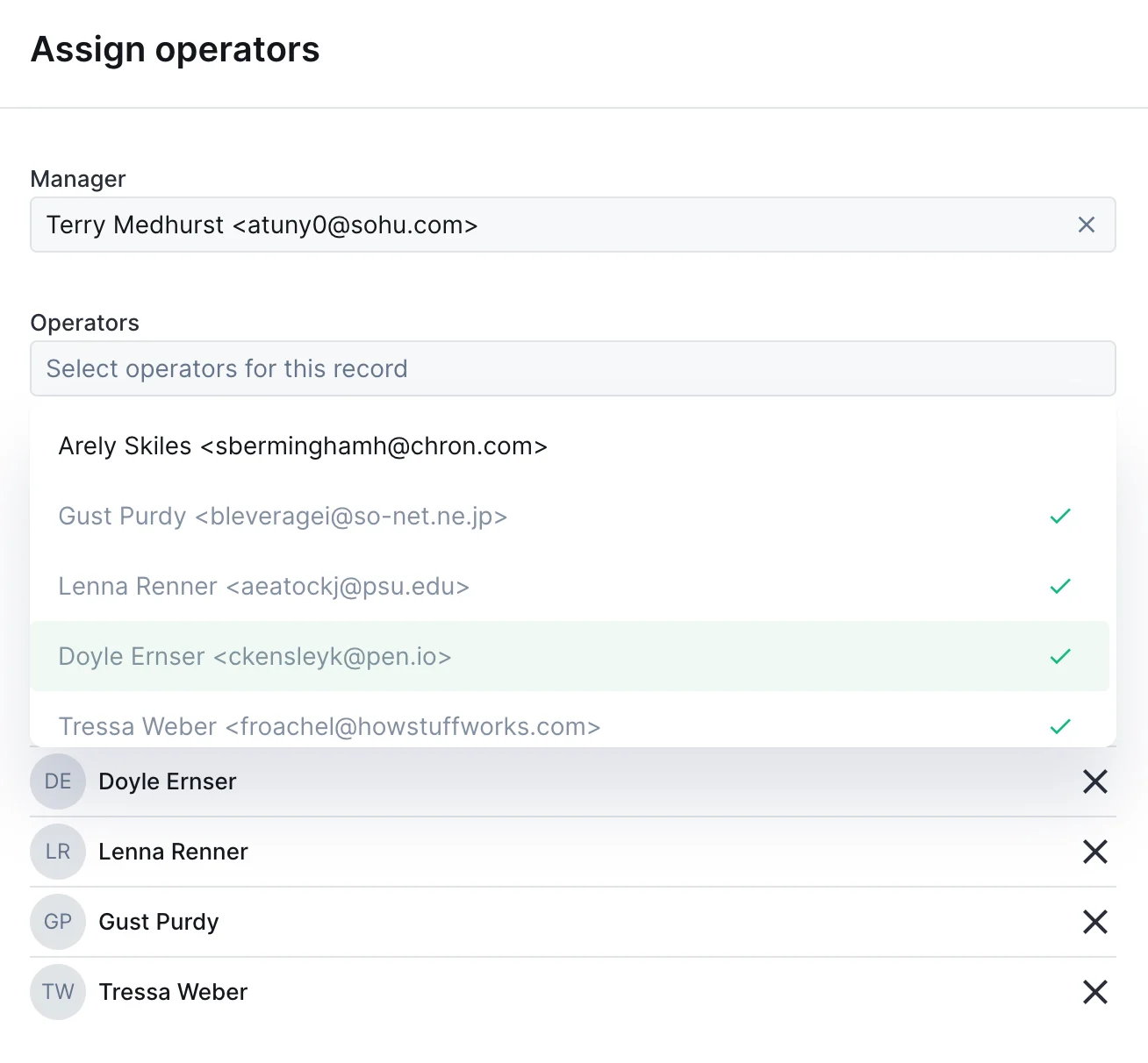
{ type: 'String', label: 'Assigned to', widget: 'UserDropdown' }
UserDropdown widget on an action form

CurrencyInput

Number input with currency formatting.
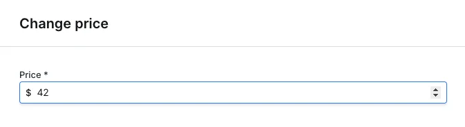
{
  type: 'Number',
  label: 'Price',
  widget: 'CurrencyInput',
  options: { currency: 'USD' }
}
CurrencyInput widget on an action form

RichText

Rich text editor with formatting options.
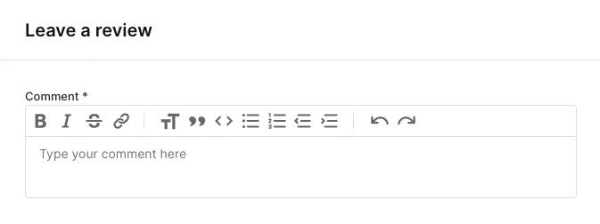
{ type: 'String', label: 'Content', widget: 'RichText' }
RichText widget on an action form

Advanced patterns

Multi-step forms

Create wizard-like forms by conditionally showing sections:
form: [
  {
    type: 'Enum',
    label: 'Action type',
    id: 'actionType',
    enumValues: ['refund', 'replace', 'credit'],
  },
  // Refund fields
  {
    type: 'Number',
    label: 'Refund amount',
    if: context => context.formValues.actionType === 'refund',
  },
  // Replacement fields
  {
    type: 'Collection',
    label: 'Replacement product',
    collectionName: 'products',
    if: context => context.formValues.actionType === 'replace',
  },
  // Store credit fields
  {
    type: 'Number',
    label: 'Credit amount',
    if: context => context.formValues.actionType === 'credit',
  },
]

Read-only fields for context

Show record data as read-only context:
form: [
  {
    type: 'String',
    label: 'Customer name',
    isReadOnly: true,
    defaultValue: async context => {
      const order = await context.getRecord(['customer:name']);
      return order.customer.name;
    },
  },
  {
    type: 'Number',
    label: 'Refund amount',
    isRequired: true,
  },
]

Validation with required fields

Combine conditions for complex validation:
{
  type: 'String',
  label: 'Manager approval',
  isRequired: context => {
    // Required if amount > 1000 and user is not admin
    return context.formValues.Amount > 1000 &&
           context.caller.role !== 'admin';
  },
}

Accessing form values

In the execute handler, access form values from the context:
execute: async (context, resultBuilder) => {
  // Access by label
  const amount = context.formValues.Amount;

  // Access by id (if specified)
  const email = context.formValues['email'];

  // Access with spaces in label
  const firstName = context.formValues['First Name'];

  // Destructure multiple values
  const { Amount, Description } = context.formValues;
}

Layout components

Organize your fields with layout components, separators, rows, HTML blocks, and multi-page forms. Useful when a form has many fields and you want to break it into manageable chunks.

Common properties

PropertyRequiredValueDescription
typeYes"Layout"Differentiates a layout element from a field
componentYes"Separator", "Row", "HtmlBlock", "Page"The layout component to render
if (Node.js) / if_condition (Ruby)NocallableOnly display if the function returns true

Separator

A horizontal line between two form elements.
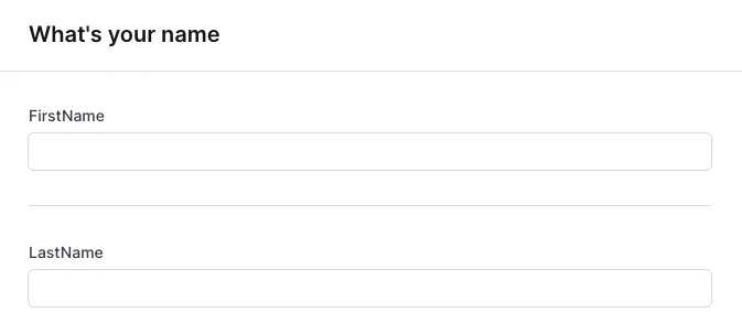
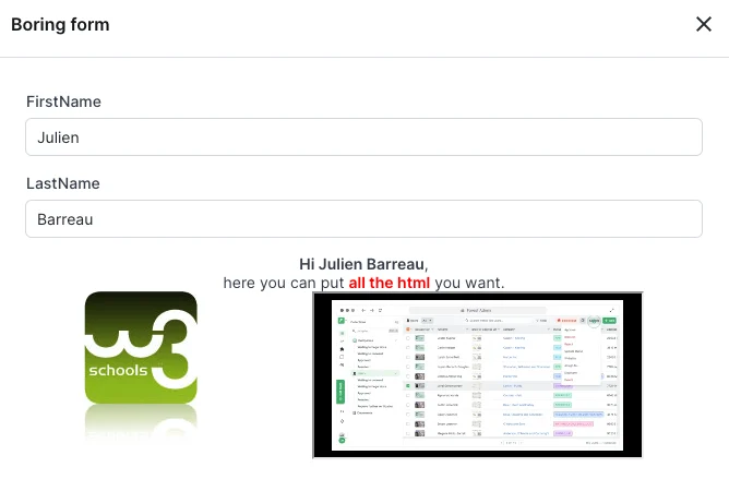
form: [
  { type: 'String', label: 'firstName' },
  { type: 'Layout', component: 'Separator' },
  { type: 'String', label: 'lastName' },
]
Form with a horizontal separator between two fields

HTML block

Render arbitrary HTML content inside a form, useful for instructions, embedded content, or rich formatting.
PropertyRequiredValueDescription
componentYes"HtmlBlock"Enables this component
contentYesstring or callable returning a stringHTML content to render
{
  type: 'Layout',
  component: 'HtmlBlock',
  content: ctx => `
    <div style="text-align:center;">
      <strong>Hi ${ctx.formValues.firstName} ${ctx.formValues.lastName}</strong>,
      here you can put <strong style="color: red;">all the HTML</strong> you want.
    </div>
  `,
}
Action form with embedded HTML content

Row

Display two fields side by side on the same line.
A row is designed for exactly two fields. If if conditions hide one, the remaining field fills the line. If more than two are visible, only the first two render.
PropertyRequiredValueDescription
componentYes"Row"Enables this component
fieldsYesarray of two fieldsThe two fields to display side by side. No nested layout elements allowed.
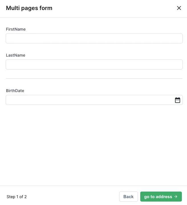
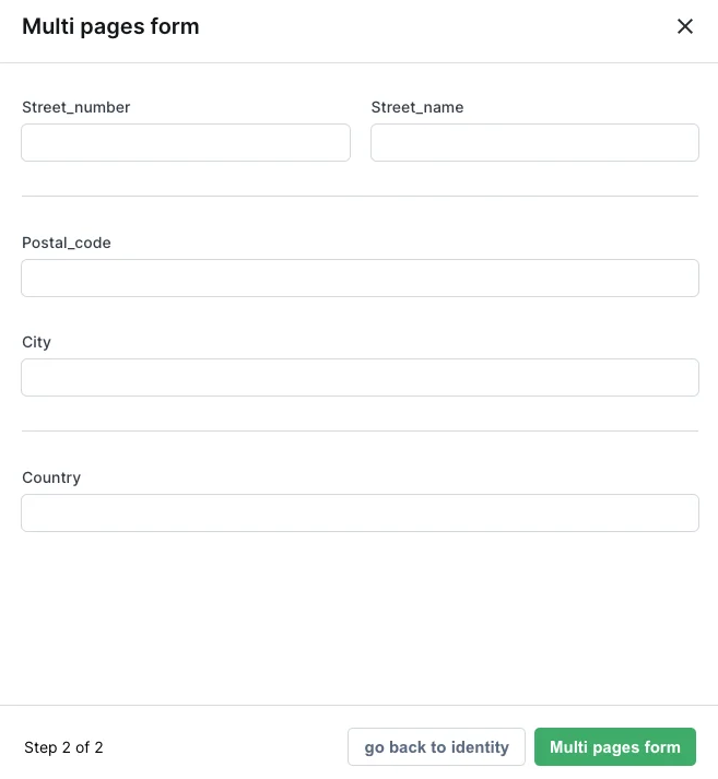
{
  type: 'Layout',
  component: 'Row',
  fields: [
    { label: 'gender', type: 'Enum', enumValues: ['M', 'F', 'other'] },
    {
      label: 'specify',
      type: 'String',
      if: ctx => ctx.formValues?.gender === 'other',
    },
  ],
}
Two action form fields side by side

Multi-page form

Break a long form into multiple pages, with next/previous navigation.
When using pages, you must have only Page components at the root of your form, no mixing fields and pages at the root, no nesting pages inside pages.
PropertyRequiredValueDescription
componentYes"Page"Enables this component
elementsYesarray of fields and layout elementsFields and layouts shown on this page
nextButtonLabel (Node.js) / next_button_label (Ruby)NostringLabel for the next button
previousButtonLabel (Node.js) / previous_button_label (Ruby)NostringLabel for the previous button
form: [
  {
    type: 'Layout',
    component: 'Page',
    nextButtonLabel: 'Go to address',
    elements: [
      { type: 'String', id: 'Firstname', label: 'First name' },
      { type: 'String', id: 'Lastname', label: 'Last name' },
      { type: 'Layout', component: 'Separator' },
      { type: 'Date', id: 'Birthdate', label: 'Birth date' },
    ],
  },
  {
    type: 'Layout',
    component: 'Page',
    previousButtonLabel: 'Go back to identity',
    elements: [
      {
        type: 'Layout',
        component: 'Row',
        fields: [
          { type: 'Number', id: 'StreetNumber', label: 'Street number' },
          { type: 'String', id: 'StreetName', label: 'Street name' },
        ],
      },
      { type: 'String', id: 'PostalCode', label: 'Postal code' },
      { type: 'String', id: 'City', label: 'City' },
      { type: 'String', id: 'Country', label: 'Country' },
    ],
  },
]
Page 1 of a multi-page action form
Page 2 of a multi-page action form
If every element on a page is hidden by if conditions, the page is automatically removed. To prevent this, add an unconditional HtmlBlock explaining why the page is empty.